We are LAB14! – The creation of a brand
As the RSBG Advanced Manufacturing Technologies GmbH has been growing through new additions, the decision was made earlier in this year to find a new name for the group. For one, the name change was desired to set us apart from our parent company, RSBG SE, a subsidiary of the RAG foundation, but also to find a corporate brand that reflects our messaging and values internally through all group member companies as well as toward the public, our potential customer, and strategic partners.
For the process of name finding and branding we decided to recruit the help of “The Yard Creative” (TYC), a creative agency.
Based in London, “The Yard Creative” is, just like Lab14, also part of the portfolio of companies of RSBG SE. TYC’s expertise is in creating engaging Brands, Spaces and Digital experiences for customers such as ourselves.
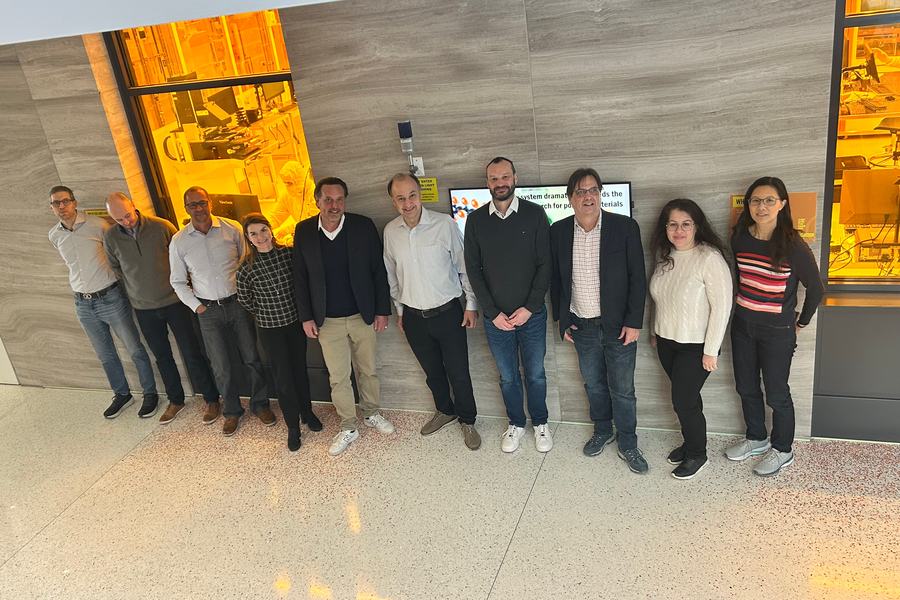
After initial virtual meetings to discuss the scope of the project, the creative team from “TYC” visited on location in Heidelberg, Germany for an in-person workshop. During this workshop, the “TYC”-team spent time to learn about the “RSBG-Advance Manufacturing”- Group and its member companies and align with our management team on preferences in messaging, visually and in wording with the use of quizzes, Legos, and silly putty.
Following this “creative-day” the TYC-team presented us with a number of choices for the name, of which we ultimately decided for “Lab14”, a combination of Lab (for “Legacy for Ambition and Balance”) and 14, referencing the group 14 of the periodic table (“carbon group”) which harbors Carbon and Silicon.
As we know Silicon and Carbon are important materials that are patterned, processed, or analyzed within many of the processes our group companies’ products are involved in. However, in another view the reference to the Carbon group is reminiscent of the origins of the RAG foundation in coal mining.
The LAB in Lab14 could be seen as the Lab as a source if innovations in research and industry.
With a clear decision in the name in hand the “TYC”-team went back to work on the visual and textual messaging that you now find revealed on our website and will be continued in our physical handout and other communications:
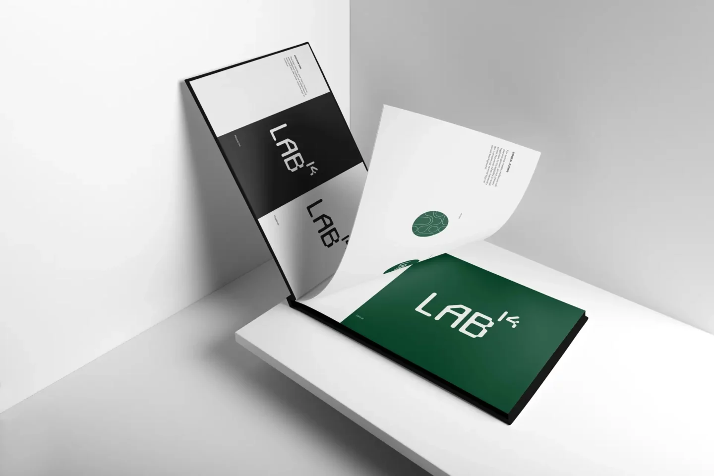
- The custom designed Lab14-logo, which invoke a sense of legacy with its slight visual reference to 7 segment displays or the computer screens of the 8-bit age.
- Our new brand’s color-scheme in which the black may again be a reference coal as well as the fresh and natural green colors which are a pointer to our commitment sustainability, which is growing in importance, especially in our technology business sector.
- Our visual language with what we call the “Bubbles” reference the connections you may see on a wafer, or a circuit board. They are a direct representation of the wordmark “We are the conductors of change.” Meaning that Lab14 sees itself and the groups companies with their innovative and game changing products and services as a conduit towards new innovations in manufacturing processes that make the future possible.